Roll-Up Banner Design That Can Be Read Across a Room
Plan a readable roll up banner with a clear headline, useful hierarchy and a layout suited to exhibitions, receptions and event spaces.
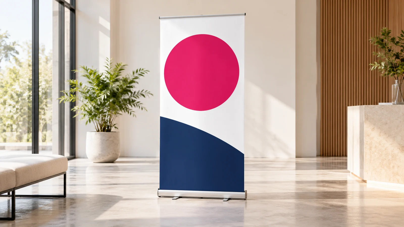
A roll up banner should communicate its main message before someone reaches your stand. Give it a clear identity, one meaningful headline and a small amount of supporting information. Detailed explanations belong in a conversation, brochure or linked page once the banner has earned attention.
Design begins with placement. A banner behind a table, beside a reception desk and at an open exhibition entrance will be seen differently. Share a photograph or sketch of the setting so the layout can account for furniture, movement and the reader’s approach.
Decide the banner’s one main job
Choose whether the banner introduces the business, promotes a specific offer or directs visitors to an action. Trying to do all three equally often creates a crowded panel. A reception banner may prioritise the company identity, while a campaign banner may lead with the offer.
Write the key message in one sentence before shortening it into a headline. This prevents vague slogans from taking up the most visible area. A visitor should be able to explain what the business offers after a quick look, even if they do not read the smaller text.
Keep important information where people can see it
Place essential identity and message elements in the more visible portion of the design. Consider whether the lower area will be blocked by furniture or people. Keep critical details away from the part that feeds into the stand mechanism.
Do not rely on generic measurements for that hidden area. Use the supplier’s artwork template for the chosen hardware. Two banners with similar finished dimensions can still have different production requirements, so confirm the actual specification before final layout.
Use scale and contrast deliberately
Make the main headline noticeably more prominent than supporting details. Give it enough contrast against the background, especially when photographs or gradients are involved. A stylish thin typeface can lose clarity at distance or under uneven event lighting.
View the design reduced on screen to test hierarchy, then review a relevant physical proof or size simulation where practical. Ask a person unfamiliar with the campaign what they notice first. If they identify decoration before the message, reconsider the balance.
Give images a clear purpose
Use one strong image or a disciplined visual composition that supports the message. A collection of small photographs may look busy from a distance and provide little useful information. Use original, sufficiently detailed imagery and suitable logo artwork.
Avoid stretching an image to fill the banner. Cropping and composition should be deliberate. If the available photograph does not suit a tall layout, discuss a different treatment rather than forcing the subject into an unnatural shape.
Make the next step realistic
A QR code can lead to a service page or event offer, but it should be reachable and scannable in the actual setting. A code at floor level behind a table is unlikely to be useful. Label the destination and keep a readable contact option available.
At an exhibition, the intended action may simply be starting a conversation with staff. In that case, do not let several phone numbers and social handles compete with the main message. Brief Onek Designs’ roll up banner service around the interaction you want.
Review the banner as part of the stand
Compare it with the table cover, brochure and screen graphics. Repeating the same full paragraph everywhere wastes space. Let each item do a different job while sharing the same identity and approved campaign facts.
Check names, dates and offers before production. If the banner will be reused, avoid including details that will expire immediately unless replacement is part of the plan. A reusable business banner and a short-term promotional banner may deserve different artwork.
Frequently asked questions
Should a banner list every service?
Usually a short group of relevant services is easier to understand. Use the banner to introduce the offer and let a brochure or service page provide the complete list.
Can I reuse a flyer layout?
You can reuse the campaign direction, but the reading distance and proportions need a separate layout. Enlarging a dense flyer rarely produces a readable display.
Does design include the stand?
Confirm artwork, printing, hardware and delivery individually in the quote. Do not assume a design fee includes physical production unless it is explicitly stated.
Brief the banner around the venue
Send the placement, supplier template and main message to Onek Designs. That gives the design a practical foundation before visual refinements begin.
Read next
Roll-Up Banner Printing Checklist Before You Approve Production