How to Design a Promotional Flyer People Can Act On
Build a promotional flyer around a clear offer, readable hierarchy and one action, with a checklist for dates, contacts, images and distribution.
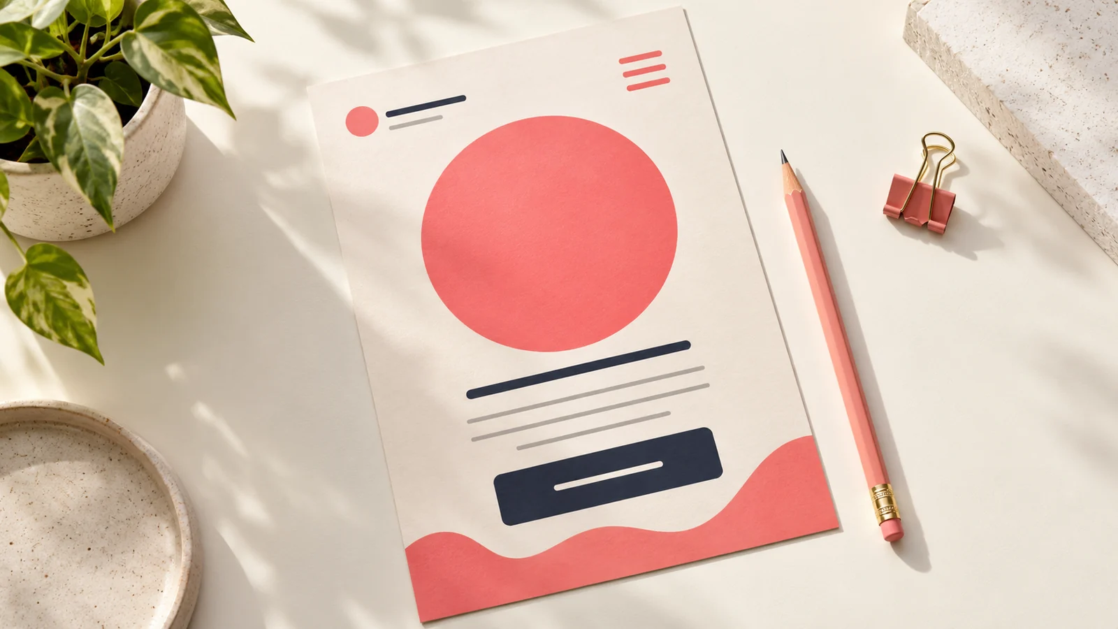
A promotional flyer works best when someone can quickly answer three questions: what is being offered, why it matters and what to do next. The artwork should organise those answers in a clear order. Attractive effects can support the message, but they cannot rescue an offer that is vague or difficult to understand.
Before choosing colours or photographs, write the offer in plain language. Decide who should respond and where they will see the flyer. A handout near a shop, a WhatsApp image and a poster viewed from across a room require different levels of detail.
Choose one main offer
Give the flyer a primary job. It might announce an event, promote a product bundle or invite bookings for a service. When every promotion is equally prominent, readers have to work out what matters and may leave without deciding.
Make the headline concrete. “Saturday family lunch” tells a reader more than “An unforgettable experience.” Supporting copy can explain the atmosphere, menu or entertainment after the main proposition is clear. Check that the headline remains accurate when the image is viewed without the accompanying social caption.
Build a reading order
Lead with the offer, support it with one strong visual and group the practical details together. Give the date, location, price or eligibility conditions enough prominence for the reader to make a decision. Place the response action where it can be found without searching.
Use typography to separate importance, not to display as many fonts as possible. A bold headline, a readable detail style and controlled emphasis often provide enough variety. Leave space around the critical information so it does not disappear into decoration.
Use images that explain the offer
Show the product, service setting or event character honestly. A food promotion benefits from a photograph that resembles what the customer will receive. A service flyer may use a clear demonstration or credible work example instead of an unrelated stock image.
Confirm permission to use photographs, logos and people’s images. Do not add sponsor marks or partner names before approval. If the imagery is a visual concept rather than a photograph of the actual offer, keep the surrounding message from implying otherwise.
Make the action specific
“Book a table” and “Request the product list” are more useful than a vague instruction to learn more. Use a contact route that is monitored during the campaign. Tell the team handling responses what the promotion includes so the conversation matches the flyer.
For a hypothetical salon promotion, the artwork could identify the service bundle, appointment period and booking number, with any conditions stated clearly. The designer does not need to squeeze the full service menu into the same image. This illustrates hierarchy, not a claim about campaign results.
Plan distribution before final design
Identify the intended print size, digital placements and quantity. A flyer designed for a social feed may need a separate layout for print. A large poster may need less detail than a handout. Ask for those adaptations when requesting flyer and poster design.
If a QR code is included, provide its final destination and test it on a printed proof. If a phone number is the main action, make it easy to read and check every digit. An unreachable response route wastes the attention the design earns.
Review with a five-second test
Show the draft briefly to someone unfamiliar with the offer. Ask what they understood, who the offer seems intended for and how they would respond. Their answers can reveal hierarchy problems more clearly than asking whether they like the colours.
Then do a separate accuracy check: date, day, venue, prices, terms, contact details and spelling. Keep an approved copy document so late changes do not circulate through several conflicting chat messages. Record the final version before distribution begins.
Frequently asked questions
How much text should a flyer contain?
Enough to support the decision and action. The viewing context matters more than a fixed word count. Move detailed menus, schedules or specifications to a linked page when they would overwhelm the artwork.
Should I include several contact options?
You can, but make one primary. Too many equally prominent actions dilute the layout and complicate response tracking. Choose the route your team can handle reliably.
How do I know whether the flyer worked?
Track useful enquiries, bookings or purchases associated with the campaign. Distribution numbers and social reactions are supporting information; they do not automatically equal business results.
Prepare a clear creative brief
Send the approved offer, audience, placements and response route to Onek Designs. The design can then be built around the action you need people to take.